I've started a new work blog over on tumblr here: http://briancoldrick.tumblr.com/
I'll leave all the old posts here but I'll no longer be posting here. Goodbye!!!
8.4.14
24.4.13
MONKS AND SPOONHEADS
Here are some concept sketches I did for Millennium fx for things which popped up on recent episodes of Doctor Who.
First up is the spoonhead/robot/girl/creature from "The Bells of Saint John". It was supposed to look very functional and not too stylised. The design is pretty much what made it the episode but it only had a very brief full shot onscreen.

Next up are some early designs for the Vigil, the evil robot/monk/alien. Being a robot monk, there's a heavy reference in some of the earlier images to Deadlock from 2000AD's ABC Warriors.

In the second round he goes a bit more steampunk. The final design used wasn't one of mine but I'm very fond of the creepiness of number 5 below. Hopefully I'll find some use for him at a latter date.

The Vigil that made it to the screen were from designs by Brooke Dibble, which you can see here along with lots of her other great work.

19.3.13
ALL THE POSTS IN ONE GO...
Here's a variety of stuff from the last six months (plus) which I should have been steadily posting here but instead I'm just lumping it up in one easy pile.
First up is another poster for the Dublin Academy of Dramatic Arts, this time it's The Crucible by Arthur Miller. The darker themes of the play and the older cast are reflected in the moodier imagery and colours. I know there aren't actually giant impaling needles in the story, it's a metaphor see?
.jpg)
Next is an illustration for a poster the folks at Mindsi were designing for Athletics Ireland. It's a skit on a superhero comic cover with different characters representing different events. I even snuck in a very Hammerstein-like robot on the discus. The type treatment here wasn't used in the end as there was existing branding but this version gets the comic cover look across best.

Back in December the good folks at Damn Fine Print organised a group show called Damn Fine Dublin as a fundraiser for their budding screen printing studio in Smithfield. I submitted this headache inducing piece full of half tone patterns. It's a testament to their printing chops that they churned this out so slicky that it actually sold out. Head over to their bigcartel store here to pick up some other prints and find out more about the outfit.

Also from December this piece was for a paper cup used at a hot chocolate stand at Dun Laoghaire's Christmas market. The stand was sponsored by the Pavilion Theatre which was next door.


This is a placeholder illustration for my friend's website, of a rocket on a Lunar Orbit Rendezvous in a night sky full of some odd constellations.


This series of poses of a happy chap was for a booklet on essay writing designed by the good people of Darling. The booklet took the slant of approaching essay writing like constructing a house, hence the little guy holding planks and blueprints.

Next up are a couple of pages from a fully illustrated short story featuring the family from the Eurospar animated ad I designed characters on. This time the family goes for a picnic in the park with the over enthusiastic dog making trouble along the way. The book was sold in Eurospar stores with the proceeds going to charity.


World adventurer, raconteur and one time associate of mine Conor Creighton wrote a novella and I did up some chapter breaks and a cover for him for a printed up version.


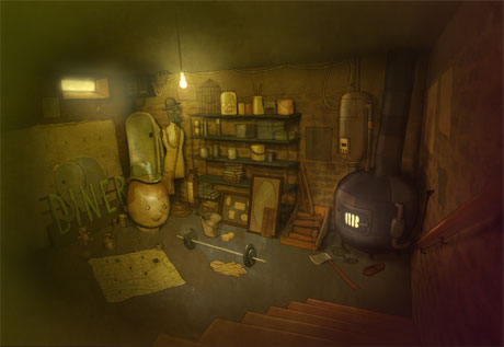
Finally these backgrounds and characters are from a computer game project which sadly imploded. The theme was that of noir style mysteries; seedy bars and crime scenes which are now never to be solved. Still I thought they were worth at least seeing the light of day here.
.jpg)
.jpg)
.jpg)
.jpg)
.jpg)
.jpg)
.jpg)


Subscribe to:
Posts (Atom)
web.jpg)